
Contributing to exchange portfolios, as a habit, began in 2001 when I attended Southern Graphic Council’s conference in Austin, Texas. Having taught printmaking in Sacramento, California for twenty years at that point, it was my first trip to an out of state conference aimed exclusively at printmakers.
What a revelation! There were thousands of us. Southwestern University hosted an exhibition of Indiana alumni and over a table of nineteen, plans were laid for an ambitious portfolio for the following year’s conference. Larry Schuh coordinated the project and incorporated high-quality binding and an array of artists responding to the theme: Taboo X/ Forbidden Worlds, Prohibitive Actions, Unacceptable Things.
In the following years I began organizing portfolios with an eye to producing projects as handsome and visually rewarding as Larry’s. I did not, however, shoot for editions as large as the Taboo X portfolio. In fact, I had my shoulder repaired shortly after completing my edition of 45 prints based on the affair between Jefferson and Sally Hemmings. Given the nine colors printed and the number of impressions along the way, I focused my prtfolios on quality—and rambunctiousness—rather than quantity.
The images below are a sampling of portfolios that I have organized, and will be joined by those organized by fellow printmakers in the next few months.
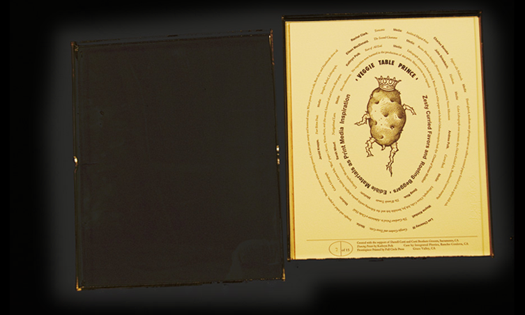
Veggie Table Prince
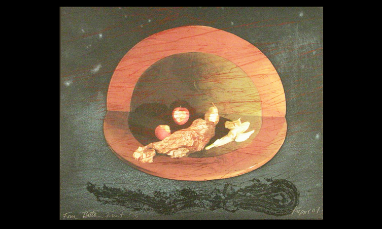
The theme for the conference in Kansas City was “Prints, Plots and Ploys.” I chose to exploit “plot” and twist it toward “garden” and (more specifically) food. I traded emails and phone calls with Andy and Kathryn Polk who peppered me with food related puns. Many of those puns ended up in Andy’s printed contribution.
In essence, prints in this portfolio were to be inspired by (or developed with) food.
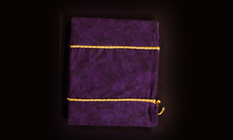
I went a step further and asked Darrell Corti, head of Corti Brothers Grocers to bankroll the clamshell box. I knew Mr. Corti was active in the arts. I had no idea that he collected books related to food and food history. He paid for the Plexiglas containers I eventually designed, and freed up funds to pay for a frontispiece and velvet draw string bag that mimics a famous liquor advertisement.
Top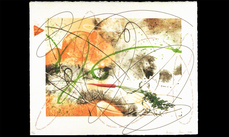
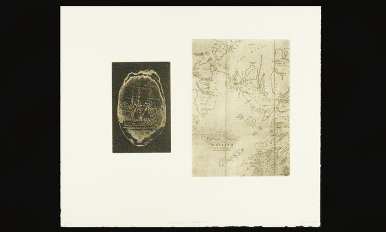
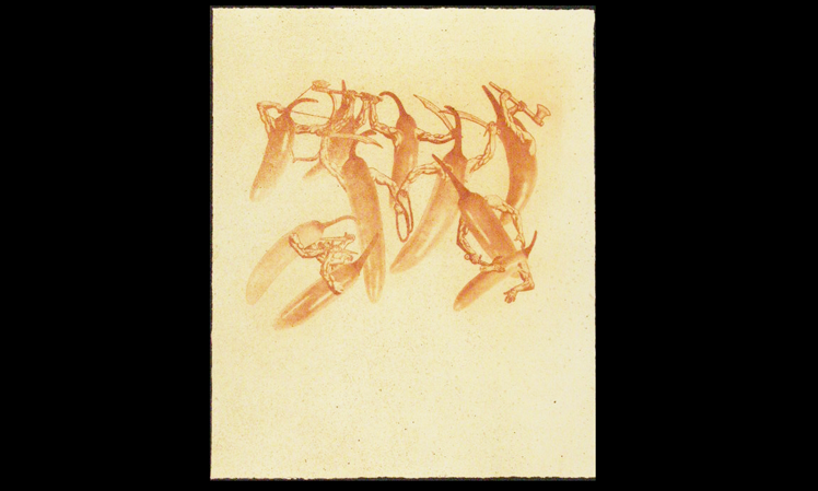
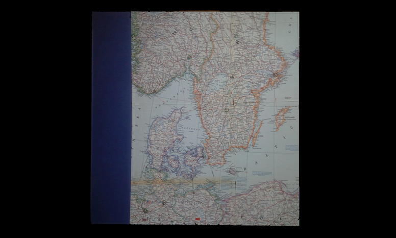
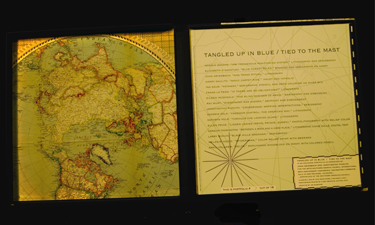
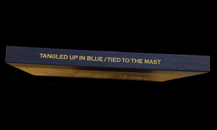
Tangled Up In Blue / Tied To The Mast
It was my turn again to develop a portfolio, but Johntimothy Pizzuto provoked me at a conference in Minneapolis. He proposed we co-coordinate for the 2012 SGCI conference at New Orleans. I already had the itch, but having someone to share to the load… and make suggestions was great. Unfortunately for Johntimothy, the Missouri River was chewing away at his backyard during many months of this portfolio’s development.
The bindery I had used for Porgy to Barack is in Cincinnati does excellent binding, and, the store part sells maps from ancient National Geographic Magazines. Hence, the substitution of maps for conventional book cloth. Each map was selected to reflect the interests and background of the artist.
Top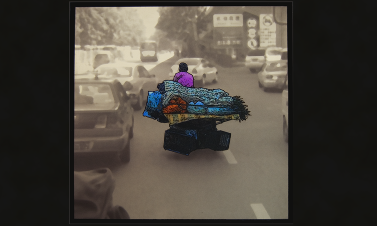


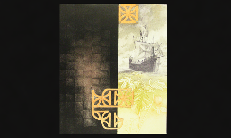
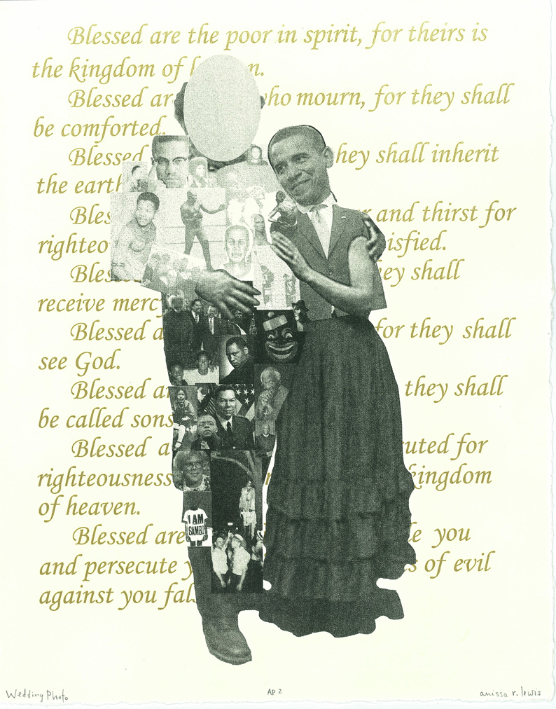
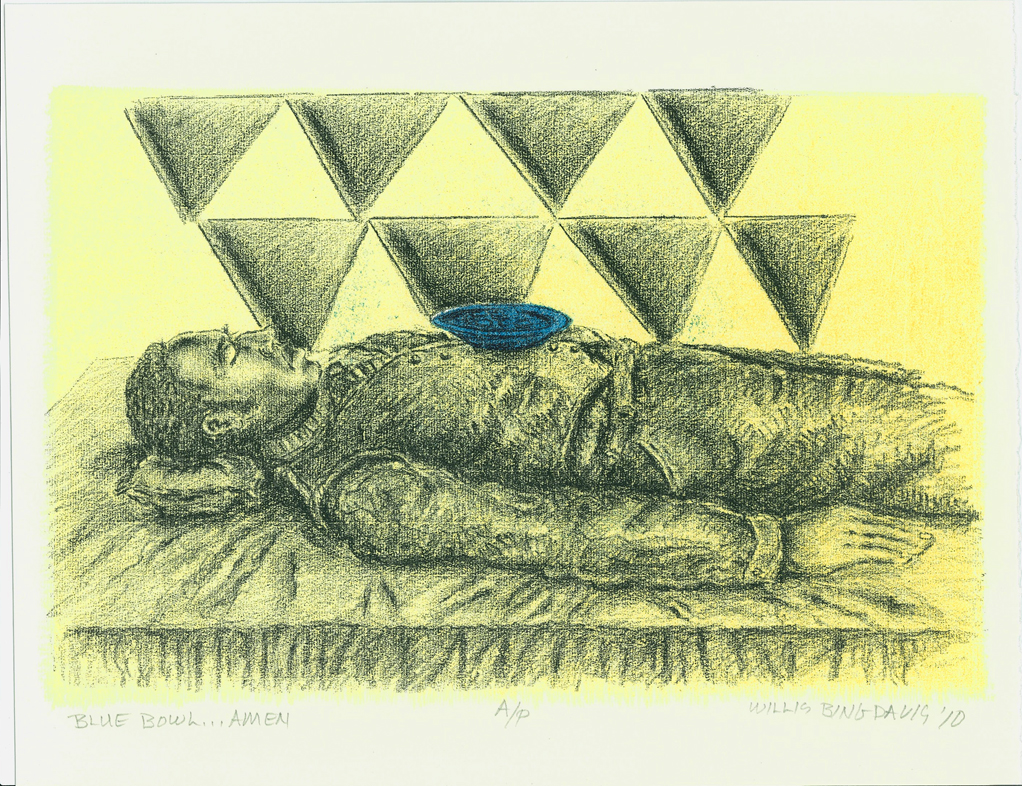
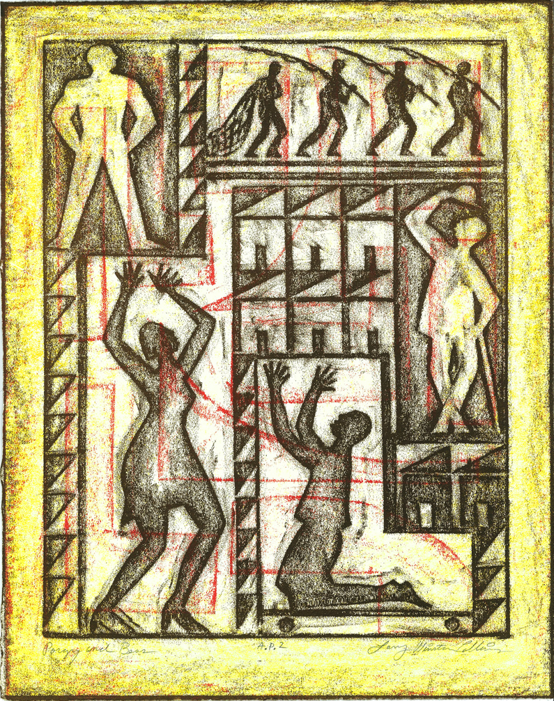
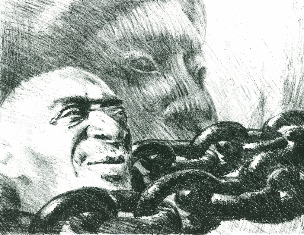
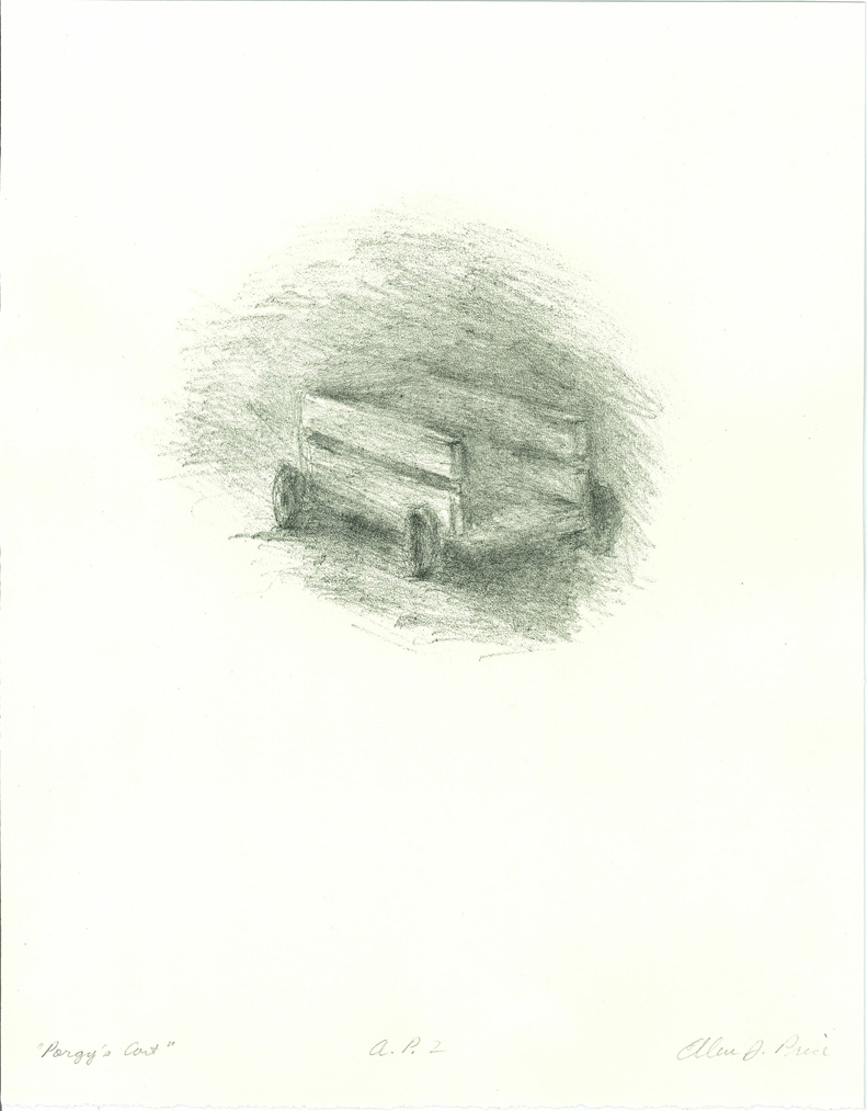
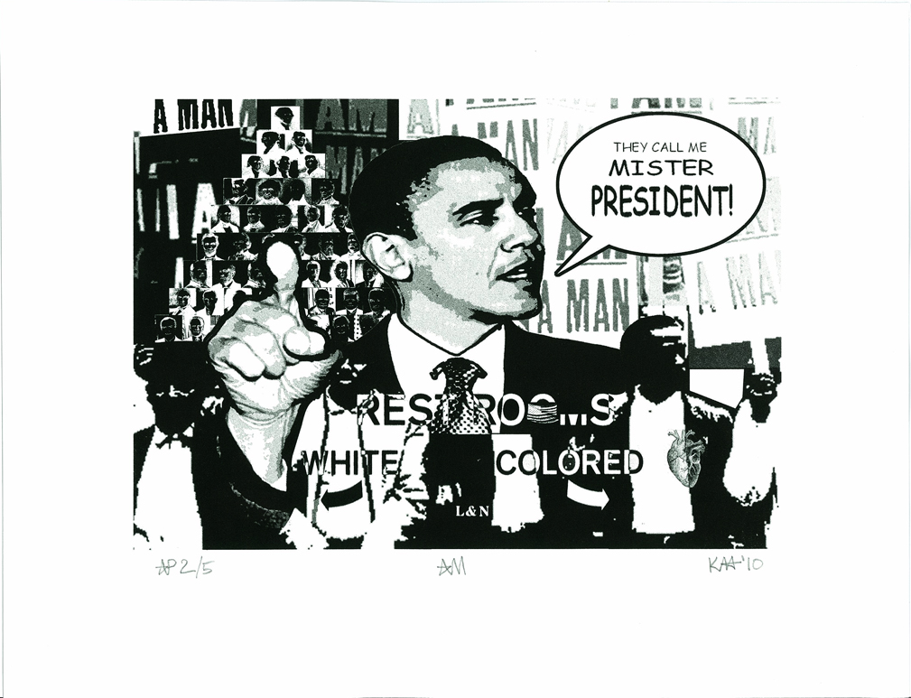
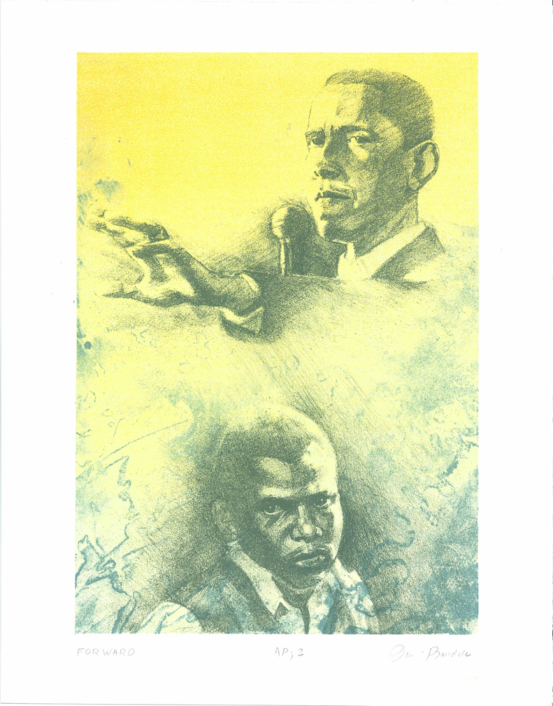
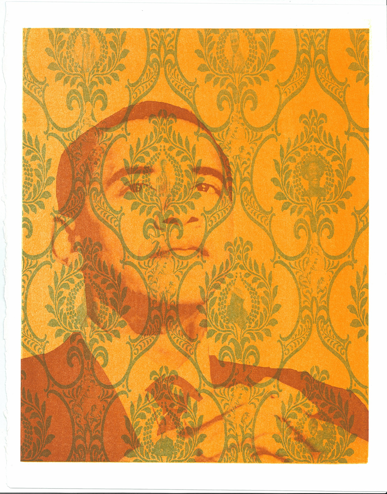
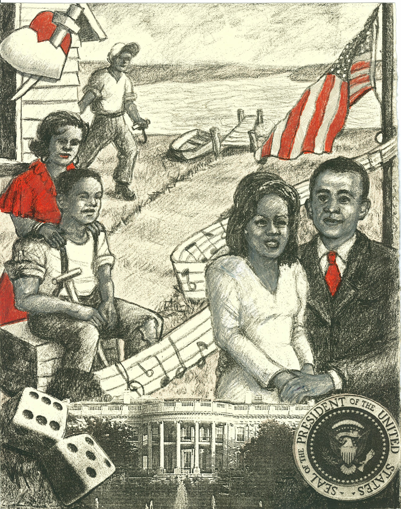
From Porgy to Barack
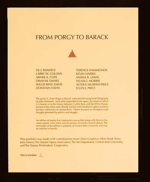
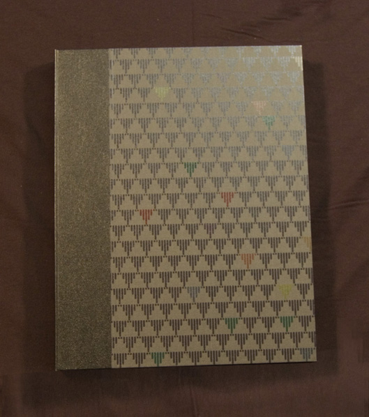
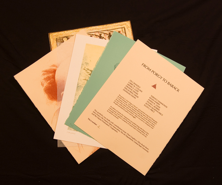
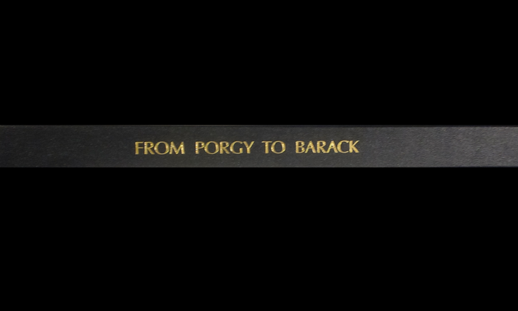
Happenstance can be a wonderful thing. This portfolio coalesced around two events in one week. On a day trip to Central State University I was shown a cache of lithography stones of high quality that had been in storage for thirty years in their original shipping crates. A few days later, one of our neighbors who worked for the Dayton Opera revealed that the following year’s opera season would begin with Porgy and Bess. The stones were too beautiful to sit idle. I began organizing a group of twelve African-American artists from the Dayton region. Each created an image and received a portfolio. Five impressions beyond the edition were given to Central State to be used for fund raising and rewarding those who give to the department. Fleet Graphics of Dayton printed the frontispiece and fabric used on the clamshell box, and the boxes were created by the bindery at Ohio Book Store in Cincinnati, Ohio.
Top

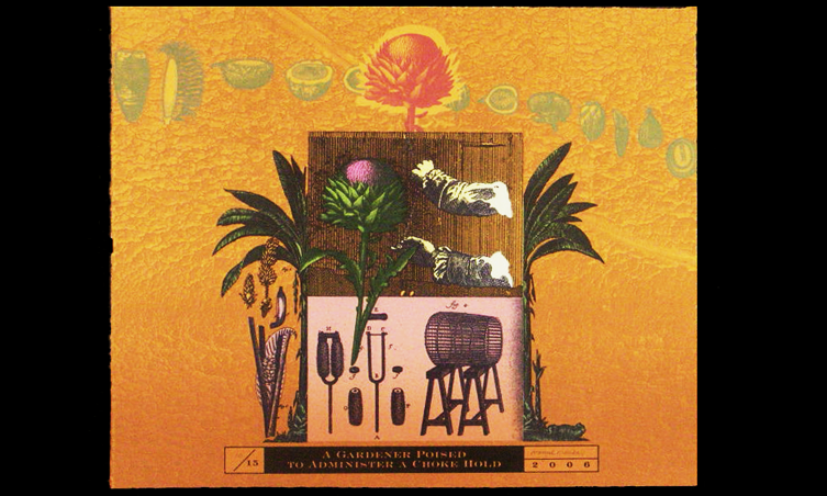
Merely Mammalian Magnetism
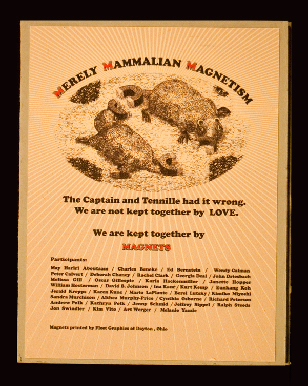
The theme of the 2009 Southern Graphics Council conference held at Columbia College in Chicago, Illinois was “Global Implications” and subtitled “Global Interconnectivity.” Given a mouthful like that, I had to do something and proposed a portfolio of refrigerator magnets. Each of twenty-five artists contributed a two and a half inch square that was printed on magnetized vinyl. Sheer luck! Columbia College had a steel sheet on the display wall immediately outside their primary exhibition space. Conference participants were confronted by this portfolio before entering the main exhibition area. The frontispiece is adhered to the front to the tri-fold (surprisingly heavy) portfolio. Each folio hold three powder-coated steel plates that provide a stable background for the images which can be rearranged to suit---or used on the refrigerator as intended.
Top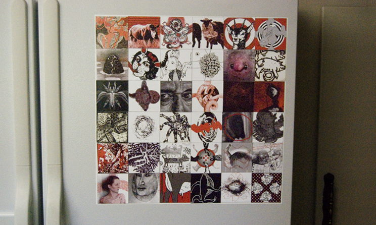


John Driesbach and his wife, Jan, live in Akron, Ohio. He grew up with the smells of an intaglio studio pervading the house. David, his father, is easily found online and is well known for his prints (most) executed in etching and engraving. One early memory is the smell of kerosene soaked sawdust favored by etchers to clean their plates and seen as toxic rocket fuel in today’s world.
John first encountered lithography in 1968 while a student at Northern Illinois University. The more senior students were “playing” with grease-soaked objects such as gloves found in the street. It was a great place to start.
He was fortunate to attend graduate school at Indiana University along with a small group of printmakers who he sees from time to time after all these years. Portfolios, such as those in this web site are a manifestation of those encounters.
John can be reached via email at jgdriesbach@gmail.com.